
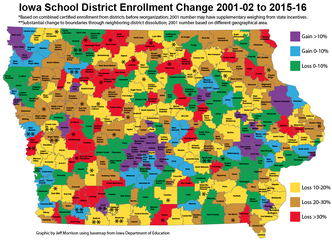
I have created a color-coded map of Iowa that shows changes in certified enrollment between 2001-02 and 2015-16. Certified enrollment is not a direct correlation with head count, because of certain formulas, but it’s the number used for all state purposes. (The best analogy is “official attendance” vs. butts-in-seats at sporting events.) The map shows a vivid representation of rural decline: With red, brown, and yellow showing the worst drops, it looks like a tree in October.
Map of Iowa school district enrollment changes, 2001-15 (names)
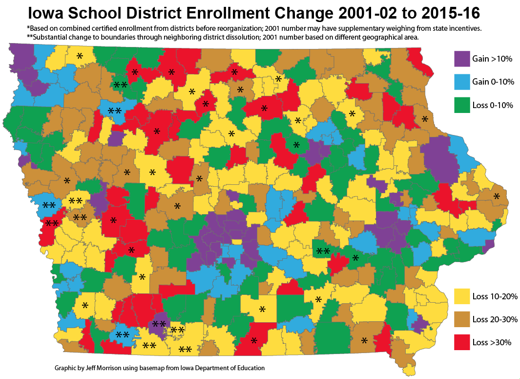
Map of Iowa school district enrollment changes, 2001-15 (outlines only)
Nearly all the districts that gained enrollment fell into three categories: Suburbs, exurbs (within about 30 miles of a city), and meat-packing plants (Denison, Marshalltown, Storm Lake, and West Liberty). A cluster of eight in far northwest Iowa is the largest exception. The few others that showed growth: Clarinda, Fremont-Mills, Lenox, Moravia, Sioux Central, and West Monona.
For districts that merged in this time frame, I added together old districts’ certified enrollments from 2001-02. This is not a perfect metric, since state incentives can “add students”, but the differences are so stark I don’t think the overall results are significantly affected. For example, Exira and Elk Horn-Kimballton independently had certified enrollments over 330 in 2001, but today’s consolidated EEHK is hovering around 400. Dissolutions are factored into the remaining districts’ numbers. (Russell and Corwith-Wesley are treated as mergers with Chariton and Lu Verne, respectively, given the overwhelming move of land to those districts.)
Of Iowa’s 336 school districts in 2015, compared with certified enrollments in 2001:
- 35 gained 10% or more, with Ankeny, Bondurant-Farrar, and Waukee blowing the doors off everyone else.
- 37 gained up to 10%. The most neutral-enrollment district is also the state’s largest: Des Moines’ certified enrollment changed by a net of 1.5, which is kind of remarkable.
- 72 lost beween 0% and 10%
- 85 lost between 10% and 20%
- 65 lost between 20% and 30%
- 42 lost 30% or more, including 33 whose boundaries never changed during this time.
While making this map I stumbled on a couple issues relevant to graphic design I thought I’d share:
- I have six categories, so my plan was for a simple rainbow palette (the U.S. map on my “College conferences and House apportionment” page is like this except ROYPBG instead of ROYGBP). The orange felt too close to the red for a map like this where there are a lot of lines, so I switched to a brownish hue instead.
- Because I have two positive categories and four negative categories, green is denoting a negative statistic. It’s the least worst (it’s the new “up”!) but since green connotes positive/go/growth, I had to think about it. I didn’t want to use a USA Today-style “shades of blue” set, and even the rainbow runs into issues of red-green colorblindness (as the NFL inadvertently discovered).
- When maps and graphics were drawn before the desktop publishing era, hatch/line/dot patterns were used to convey different categories of information. See, for example, this map of population growth created in 1921. On such a busy map with detailed, crooked lines, patterns seemed to confuse more than illuminate, and “color-hatching” wasn’t an option. Solids were definitely the way to go.