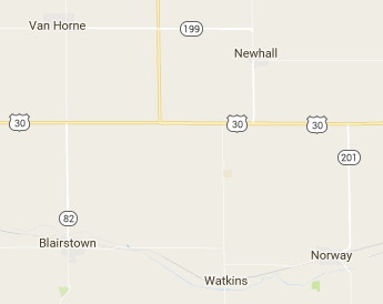
In the current tech contest to make any website unusable for anyone with a real computer and worse than 20/15, 500-shades-of-gray vision, Google has taken a whack at Maps — and I mean whack in the East River sense.
So as part of this update, we’ve removed elements that aren’t absolutely required (like road outlines). The result is a cleaner look that makes it easier to see helpful and actionable information like traffic and transit.
DO YOU KNOW WHAT LINES ARE FOR? THEY ARE MEANT TO DELINEATE THINGS. THAT’S WHY LINES ARE IMPORTANT. YOU CALL THIS “CLEAN” I CALL THIS NEARLY INDISCERNIBLE.

County Road E66 is visible between Blairstown and Norway — can you see it? This screenshot also nicely illustrates the other big issue with Google Maps — the accuracy on updating obsolete information continues to be haphazard at best. IA 199 isn’t even the right position!
Everything on the new Google Maps is far, far paler, and there are fewer types of road markings. The two-lane and expressway US 30 are not shown with separate markings, as you can see above. In fact, the entire segment between I-35 and the Cedar Rapids bypass looks the same. It takes a zoom to 2000 feet to see a four-lane, and even at that level, good luck trying to see on- and off-ramps at a glance. Interstates/freeways are a much lighter orange. Urban areas are now all gray, barely contrasted with the very light beige for undeveloped land.
And did I mention that street names are either in gray or a font so thin it doesn’t look black?
Google’s idea of “clean” has a lot in common with Jony Ive’s approach to Mac OS software design, which is to “flatten” the life out of everything and remove visual cues, especially outlines.
Google, instead of (bleep)ing up the look and feel, work on getting correct information and controlling the computing horsepower needed to render the maps. Stop acting like you hate your users, or at least all the users who aren’t Silicon Valley hipsters glued to their phones.
