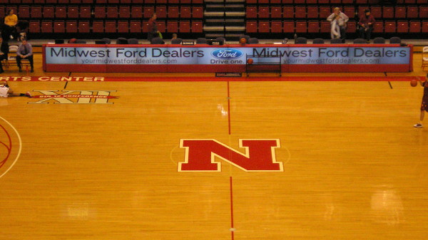
This is what the Devaney Center basketball court looked like Jan. 26, 2011 (my picture):

And here’s what it looks like now. (I originally had a screencap from CBS, but the link has a wider image.)
Big Ten logos at Nebraska games are still weird, and still so wrong.
Nebraska’s website still has the press release from when the court was refurbished in 2004. This Nebraska fan forum topic indicates the court was redone in 2011, although honestly it looks like the bigger N and Big Ten logo are big decals over the old ones because of the white bases. The phrase “Bob Devaney Sports Center” has switched sides and is now in a blocky font as opposed to what might have been Helvetica.
Unlike Hilton Coliseum, the basketball court is a permanent part of the building, according to this Lincoln Journal-Star piece from 2010.
The logo at the center of Carver-Hawkeye Arena got bigger in 2011 as well, the post-1994 ISU logos are big, and plenty of other arenas use big center-court logos. (See my Texas and A&M posts from January 2012.) I suppose it’s a branding thing, but at current levels they makes the court look too “busy.” There’s something to be said for the minimalist look the Devaney Center court had in the 2000s.
