
Over the last couple of years, Google Maps has steadily been encountering feature creep and some decreases in quality. Yesterday, things took another turn for the worse.
- The point size of all route markers has been decreased. It’s much more difficult to read. I keep clicking to zoom in some hope they will become bigger. In addition, the numbers do not line up! See, for example, below:
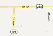
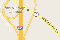
Look at the numeral “1”. It is a little taller, or starts a pixel higher, than the others. In addition, it’s not kerned correctly. These images key along to the next points:
- Route numbers are not centered properly. Look at how the “2” in I-280 touches the edge, and how a single-digit US 6 isn’t aligned. US 61 (not shown) is too far to the left. This is literally a one-pixel issue, and it may take some eyeball adjustments by an actual person to tweak.
- The Iowa road name dataset is sorely outdated. Many of the spur routes from the Second Great Decommissioning appear on the maps — they’ve been dead for nine years and 11 months — and there are some from the 1980s. IA 233 east of Albion and IA 311 east of Liscomb are still there.
- The Iowa road name dataset is missing county roads. Unless the road was named as such in the E911 system, a county road designation does not appear anywhere. And even in places where that IS the case, Google is attaching the county road designation it “should” have. For example, E69 in southwestern Tama County is not labeled E69 at all, but 390th Street.
- Some designations are just plain wrong. Even when IA 198 and IA 394 were alive, they never went north of US 218 or Donnellson, respectively, but at least one marker appears.
- The US shield design, which has been messed up for a long time, still hasn’t changed. This may have a bearing on the centered-number issue above, although it affects numbers on any shield.
- Style conventions are inconsistent. City names start out lowercase but become all-caps at the 2000-foot zoom level. These names, although bold, are in a smaller point size than the street and landmark text, which may also have changed. Park/lake names are now italicized when they didn’t use to be (which isn’t inconsistent so much as another aesthetic change).
- And for the love of Rand and McNally, why can’t there be a toggle for county lines?!? Mapquest has displayed them for 15 years!
I’ve searched for a general feedback page or e-mail address, but can’t seem to find one. (Ironic, yes?) The errors are too widespread and systematic to narrow it down to a specific location and say “Report problem here.” I don’t know what’s going on in the Googleplex, but perhaps the team needs a road geek or two.