
No wonder today’s students can’t understand capitalization rules. Informal typing is one thing, but then there is this ridiculousness. First, this is how election results (in this case, Iowa’s) look on CNN’s website.
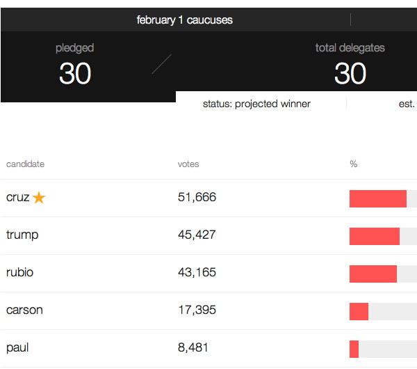
There isn’t a single capitalized letter to be seen, not even the candidates’ names. Is it a coding script thing? If so, the code needs to change to “capitalize first letter of any text string.” Is it a design thing? If so, there are designers who need to be beaten over the head with a textbook or two. (The AP Style Guide is too lightweight.)
Then there’s the Girl Scouts of America, which in a national rebranding in late 2012 put not only the names of the cookies in lowercase, but the organization’s logo itself. This typographical travesty has an identifiable culprit, “the New York office of Anthem Worldwide, the brand development division of Schawk Inc.”
Switching to lowercase letters is supposed to convey “friendliness” but this is extreme to the point of violating basic tenets of the English language. (lol like ppl care about those —Ed.) It’s incorrect to the point of distracting, at least to those with a semblance of education. The only positive thing I can say about intentional un-capitalization in anything that isn’t an Internet chat is that it’s not as bad as turning crimes against the written word into performance art.
The Girl Scouts provided another example of Morrison’s Law of Shrinking Products* in action, too. The previous package of Thin Mints contained “about 8” servings of 4 cookies apiece, and the current one contains exactly 8, shrinking the total from 34 to 32. (Of course, it often ends up as, “Serving size, 1 sleeve; servings per container, 2.” Or is that just me?)