
Memorial Day weekend in odd years means the release of the new Iowa highway map. The 2023 map (extremely large PDF) was available online a week ago. But when I loaded it, things felt off. The shade of blue was noticeably different, and noticeably duller. The overall border of the state map is a better blue than what’s shown below right, which is very odd. The inset maps on the back still have the correct/previous coloring.
The above comparison is done in RGB (red-green-blue) screen values rather than the CMYK printing process (cyan-magenta-yellow-black). Here’s an explanation of the color wheel and the difference between additive and subtractive colors.
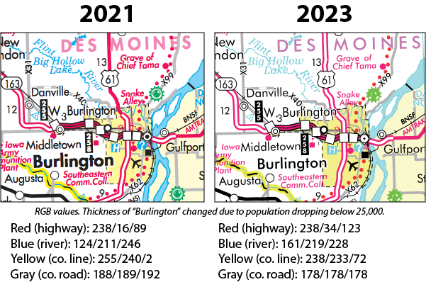
The 2023 map’s blue color has a lot more red value in it and less blue, tilting it toward more of a teal than the brilliant sky blue it had been. The red for the highways got a bit more green and blue, giving it a very slight pink tinge. The yellow is duller with its larger dose of blue, looking more like a highlighter mark after it’s been there for a while. The green for interstate highways, not seen in the clip, seems duller as well.
Typography-wise, lettering for all the special features appears to have been thinned out. The county names definitely got thinner and shifted from a dusky pink to lavender.
The 2023 map has been updated to reflect populations from the 2020 census. Burlington, Clinton, and Fort Dodge all fell under the 25,000 threshold, so they get less prominent type. Waukee just missed that level, but hit it by July 2021 according to census estimates, surpassing those county seats and also Ottumwa. Harlan, Shenandoah, and Vinton fell below 5,000, so their names are also diminished. (But Vinton now looks to be in the under-1000 point size, smaller than Urbana, which shouldn’t be the case.)
Highway-wise, the most notable changes on the map are the extension of four-lane US 61 north of Burlington to near Mediapolis, which will be done very soon, and extension of four-lane US 30 to east of IA 21, but without an interchange square because that’s not finished either. The Council Bluffs inset still shows NE 85, which is no longer a highway in the Omaha area.
A printed map will look different from what’s on a screen, but these colors are decidedly VERY off. Is it due to the blue border? Perhaps the map was processed with a different color profile/color management setting?
UPDATE: OK, now things are getting weird. All of the above criticism applies when you view the state map PDF as a whole. But, if you go to the individual sections that are available on the map page, the colors there look like they have looked before. Here’s the southeast corner. I’m baffled.